












Toasty
Brand & VISUAL DESIGN
Toasty made sustainable shopping fun. We helped make it feel premium too, without losing the fun.
Toasty had made sustainable shopping desirable instead of guilt-driven.
The catch: the brand looked like a deals app, which kept higher-end labels out of the catalog. Our job was to raise the register without killing the energy.
Design : Logo Design, Brand System, UI, App Store Creative
Bridging the gap between values and budget
Toasty is a mobile shopping platform designed to make eco-friendly and ethical consumer products accessible and affordable.
It curates a selection of responsible, sustainable brands spanning fashion, home goods, personal care, food, and cookware—such as Birkenstock, Caval, and HappyVore.
Limited-time discounts are offered directly within its apps. Beyond discounts the app adds a twist with engaging challenges & rewards to bring on the fun.

From deals app to curated catalogue
Premium brands are picky about where they get sold. Before saying yes, they check the overall servuce and ask one simple question: "Does this place look like us?"
For Toasty, the honest answer was "not yet." The playful codes that won its first audience were now working against it, as the visual language said “discount” more than “discovery”.
The brief we gave ourselves was short: keep the smile, lose the noise. Warmth and accessibility were our real assets. The job was to put them in a more confident, more editorial frame.

A refresh, all the way down
We started with the logo first. We simplified it and removed the face: less childish, more elegant, and much sturdier at small sizes, where an app icon actually lives.
Still recognizably Toasty, just grown up. Around it, a new system. A more mature palette, toned down and drawn from real, physical materials, a quiet nod to what sustainable products are made of.


Less shouting, more curating.
And a serif typeface with more elegance, keeping just enough roundness to stay friendly. Every choice pointed the same way: less shouting, more curating.


Same voice, everywhere
A premium brand falls apart the second one touchpoint stays behind. We started with the app store pages, the first place most people meet Toasty. Then something we love happened: Toasty's team took it from there.
They rolled the new identity out on their website themselves, and brought its visual codes to their Instagram. Same voice, no hand-holding. Whoever meets Toasty first, a shopper or a brand founder, now gets the same impression.

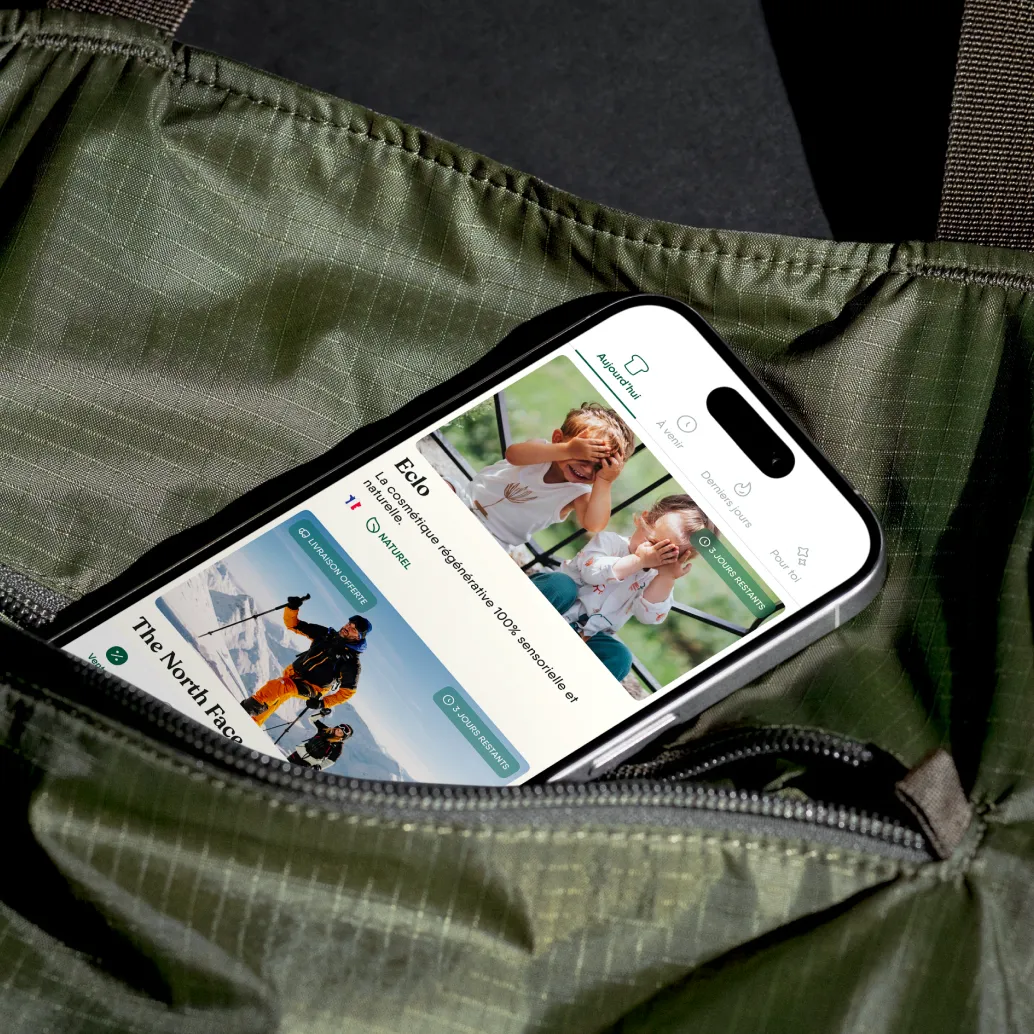
A place premium brands want to be seen
Since the refresh, Toasty has started attacting more premium labels into its catalog. Brands that would have hesitated before now see a place that looks like them.
That was the whole point. Not a prettier app for its own sake, but a brand that opens doors Toasty couldn't open before.


❝
Thanks The Design Crew for this collaboration we're happy to see the result of this work.
Can’t wait to get this into our users' hands!
———————————————
Raphael Doulonne
PRODUCT @ TOASTY
We thank the Toasty team for trusting us working hand in hand one on this brand refresh.
• 1 month sprint •
25 touchpoints refreshed, from logo to app store
15 screens Redesigned with the new system
12 weeks from kickoff to rollout
Other projects